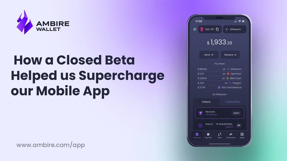
How Closed Beta Feedback Supercharged Our App
Ambire's user testing process led to invaluable feedback and insights. This article delves into how user feedback supercharged our app, leading to significant improvements.

Many crypto startups boast about building Web3 products for people, but often overlook the crucial step of involving users in the development process. As a result, products are launched that only a select few truly understand. At Ambire, we have taken a different approach.
By engaging users in the Closed Beta, we opened up an invaluable channel for collecting feedback and insights. This user-centric approach allowed us to identify areas where improvements were needed, ensuring that our final product would genuinely meet user expectations. In the following sections, we delve into some of the key changes we made to our apps based entirely on the valuable feedback we received.
The Closed Beta
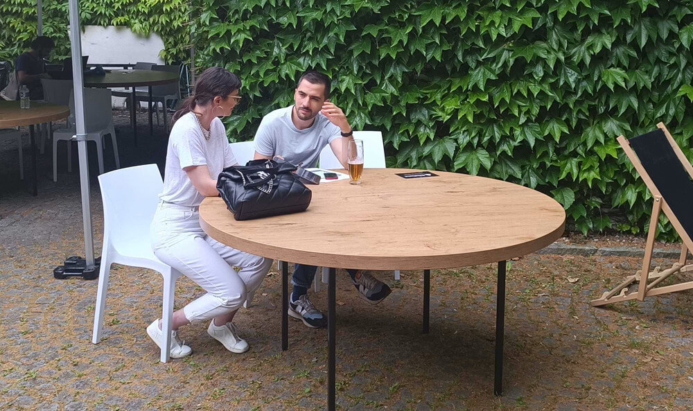
In early June, we carefully handpicked early testers from our community and invited them to try our iOS and Android apps with prepaid gas fees thanks to Ambire's account abstraction features. Additionally, our team visited ETHPrague, where we conducted live usability tests and talked to people using mobile wallets to collect feedback and ideas on how to improve our mobile apps.
To our surprise, we found that with rather small changes to how our apps look and work, we could improve the user experience significantly. What did we do? We listened to our users...
The importance of a clear Welcome screen
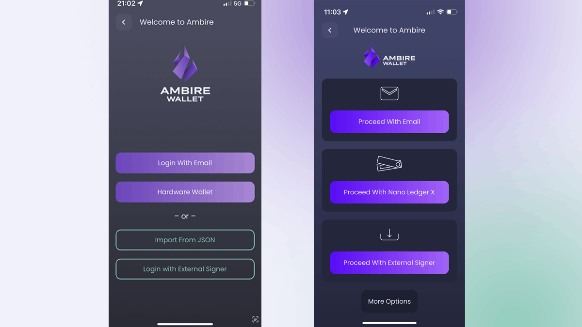
The screen on the left is our initial welcome screen, on which the users chose how to create an account on the Ambire mobile app. However, there are several problems here:
- Most users were confused about why there are two types of buttons
- There is a weird "or" text which implies that you choose between two types of actions, while in reality, all actions are of the same type.
- There were discrepancies in the UX copy. Three of the buttons included a verb, while the fourth one was just labeled "Hardware wallet".
The new screen: We left only one type of button, added pictograms, and hid the most advanced and rarely used option.
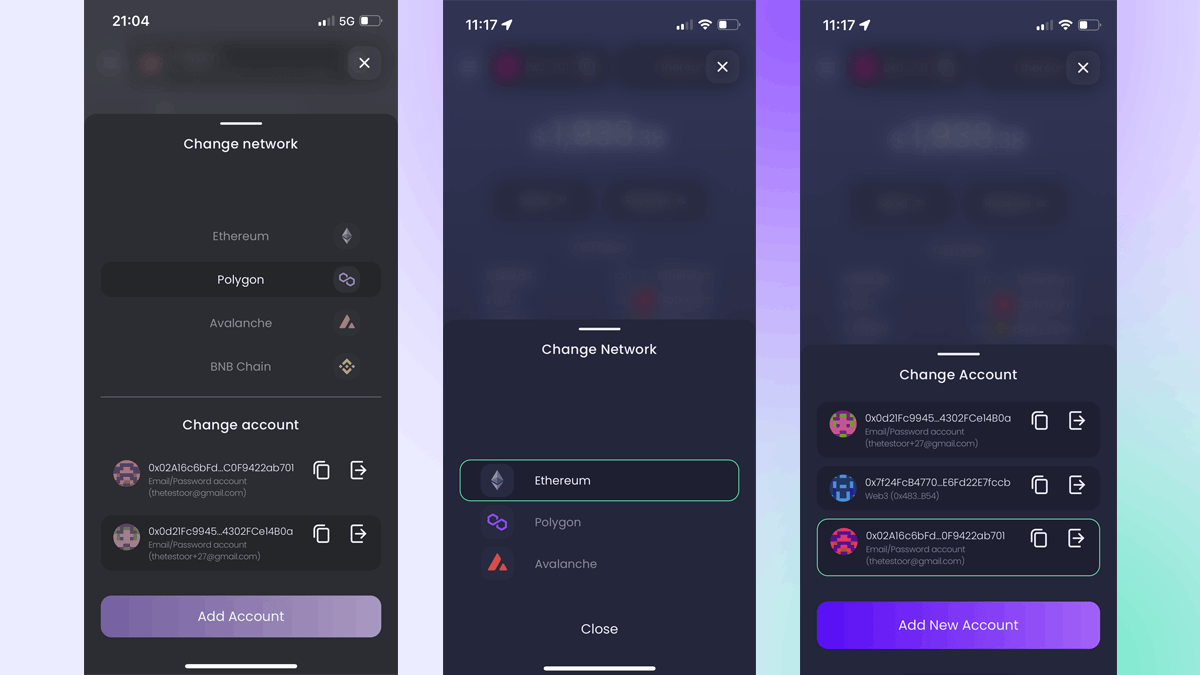
A dashboard that says it all
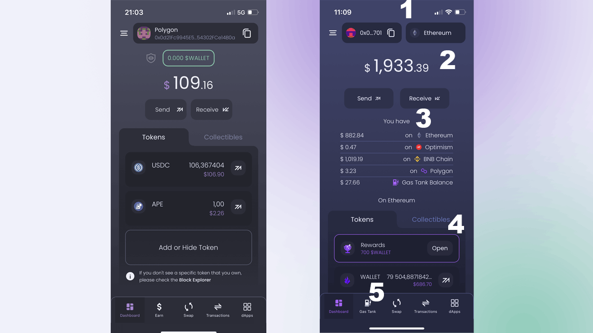
- On the first version of our apps, network, and account selection were accessed on the same button on top.
However, the selection modal was causing a lot of confusion. To change the network, one could simply tumble through the available networks and change it. However, at the bottom of the screen, there was a button for creating a new account, and most people clicked it without paying attention, thinking this will change the network. The logical solution was to separate both actions into different buttons and modals. This eliminated confusion instantly.
2. and 3. Most users expected that we show a total account balance on the app, but instead, we were showing a balance on the current network and available balances on other networks beneath.
This didn't give one a bird eye view of the total balance, so we changed it. Now you can easily see the total balance of your account, followed by a breakdown by networks.
4. Through our usability tests, we discovered that people hardly noticed the $WALLET rewards button on top of the screen. Since this button is about having tokens to claim, we decided to just put it on top of the tokens list and drastically improved its visibility.
5. During each session, we asked our users to top up their Gas Tanks. The Gas Tank, a feature that allows you to prepay your network fees and save, was very well received by all testers, and most of them pointed to it as our "killer feature". However, we didn't do much to make it visible - it was hidden in the hamburger menu instead of being pinned all the time in the main navigation. We fixed it, but additionally, we changed the way it actually works.
The Gas Tank and Transactions
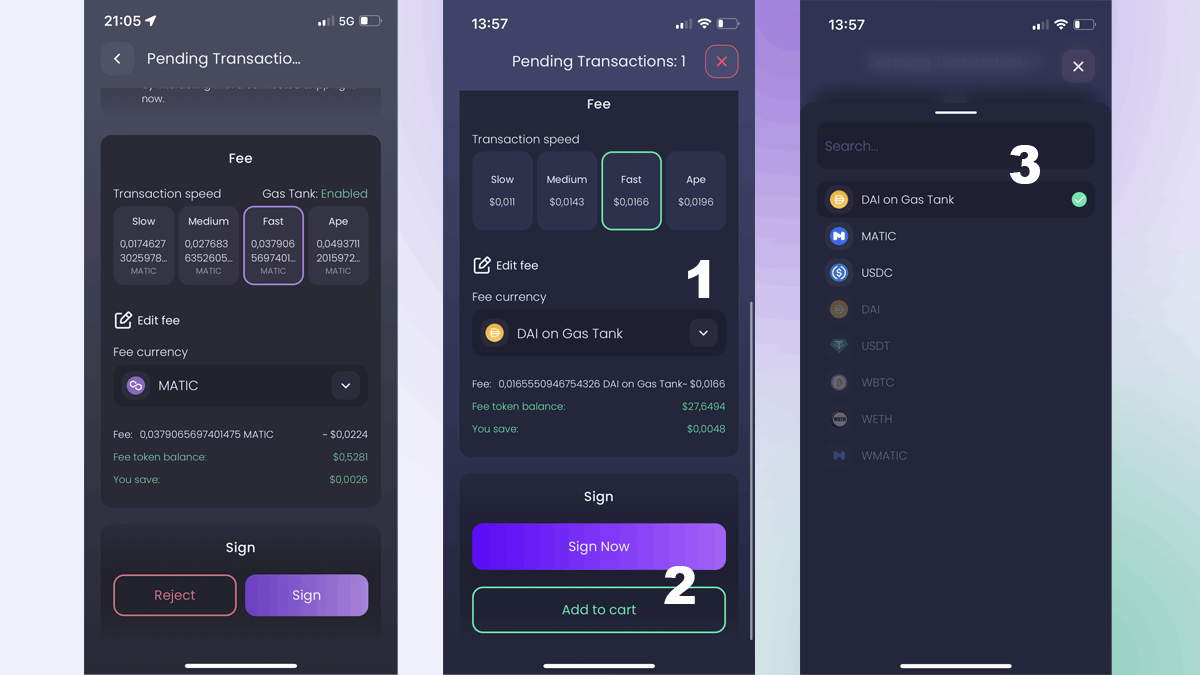
Previously, our Gas Tank was disabled by default. At our usability testing sessions, one of the main tasks for testers was to top up and test the gas tank. After (hardly) finding it and topping up, they tried to pay for network fees using the Gas Tank, but they always expected it to be On by default. However, they had to go back to the tank itself and turn it on before they can use it.
We reworked our Gas Tank so that now it is On by default. The user can choose to pay network fees with tokens in the Gas Tank or tokens in the wallet. This change instantly improved how users perceive and use the Gas Tank.
One of the account abstraction-enabled features of Ambire is that you can combine (batch) many transactions and sign them at once. The way it works is you just leave a transaction without signing it, and this adds it to a batch. However, most users aren't used to this flow, so thanks to user feedback, we added a familiar Web2 concept - "Add to Cart". When the time has come to sign a transaction, you can:
- Sign it
- Add it to cart
- Reject it
Success! (screen)
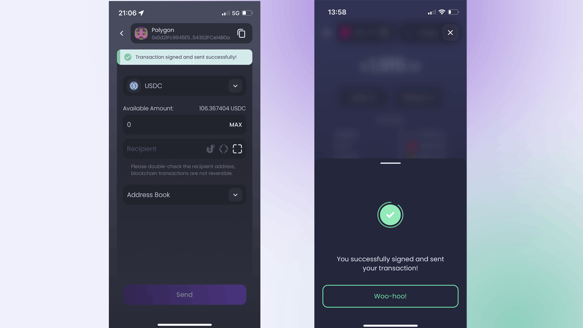
Our testers pointed out that we don't have a success screen on our app. When a user signed a transaction, the app returned to the previous screen. If the user was swapping tokens, the app returned to the swap screen and looked like the operation is not done. One of our testers pointed out that users usually don't pay much attention to their screens when doing something on their mobile phones, so they could easily miss it if they have signed a transaction.
We introduced a looping success animation to clearly indicate an action has been completed.
The unobvious browser
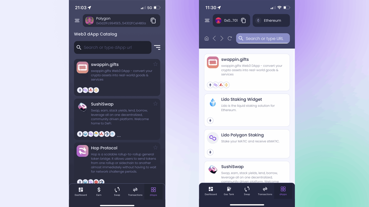
Which of these screenshots shows a mobile browser? The answer is both! However, in our first version, the dApp browser didn't look like a real browser, and users usually missed it, thinking that the search bar only searched between default dApps. We adjusted colors and added browser icons to make it clear that this is actually a real browser.
What's next?
The Ambire wallet mobile apps for iOS and Android will be out by the end of this month. However, if you want early access (with perks), you can sign up on our website, or you can join our Discord server and convince us why you should test the apps before the public...
Interested in Ambire? Follow us:
Discord | X (Twitter) | Reddit | GitHub | Telegram | Facebook