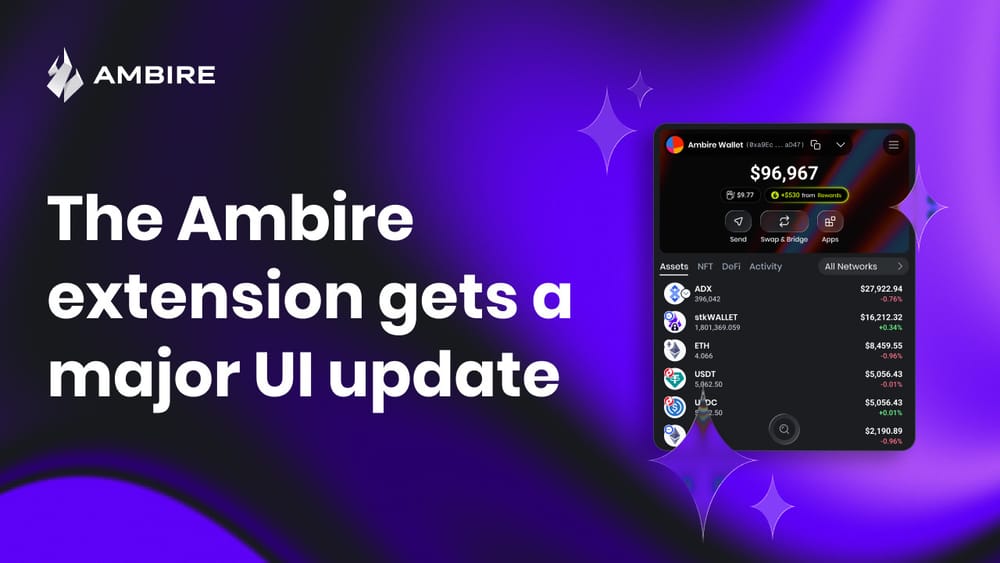
The Ambire Extension Gets a Major UI Update
Ambire is rolling out a major UI refresh for its browser extension, with a slimmer layout, clearer action buttons, and a redesigned token details page, all aimed at improving usability and bringing the desktop and mobile experience closer together.

Slimmer layout, updated UX, and groundwork for the Ambire mobile app
Today, we’re introducing the refreshed UI of the Ambire browser extension. The redesign has been underway for several months and focuses on a cleaner layout and better usability.
The work began while preparing the next version of the Ambire mobile app. We started designing the mobile interface using the existing extension screens as a reference, adapting them to smaller displays.
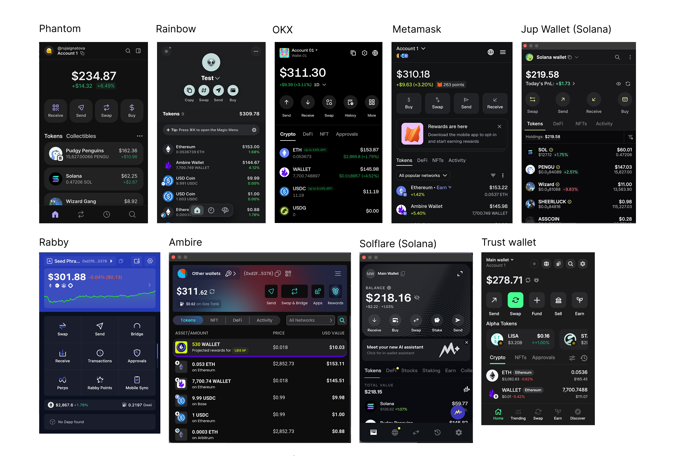
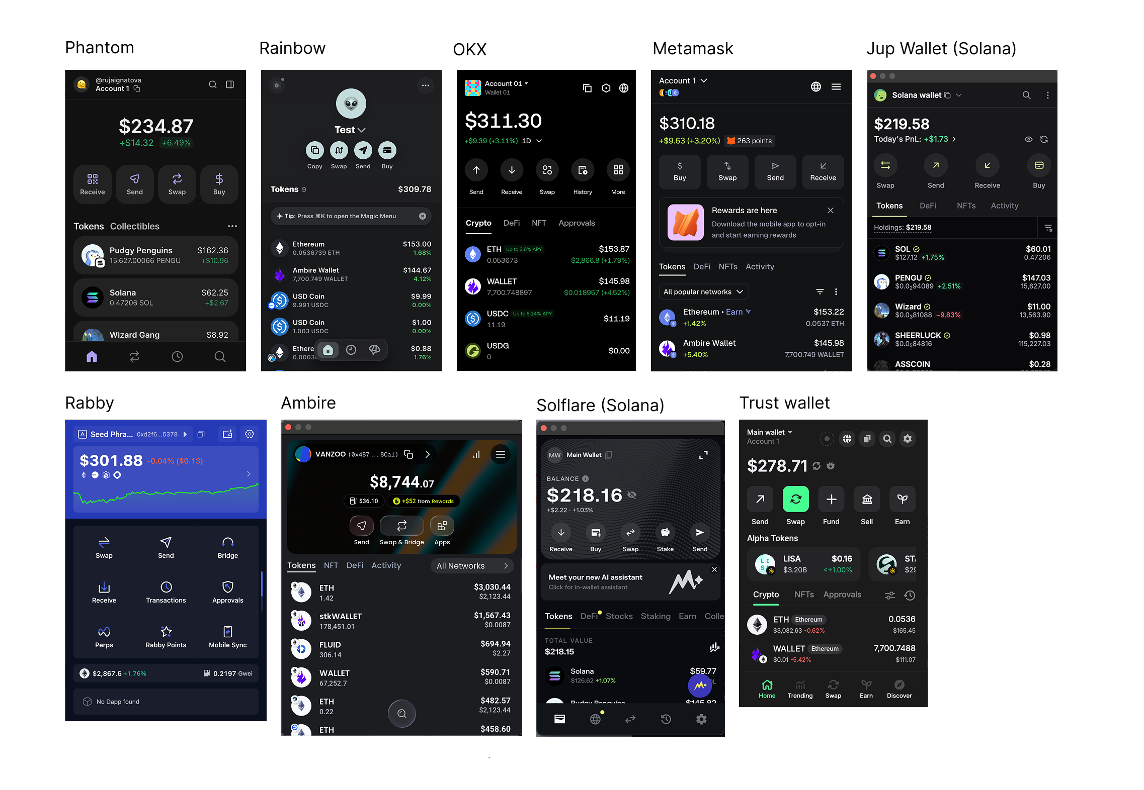
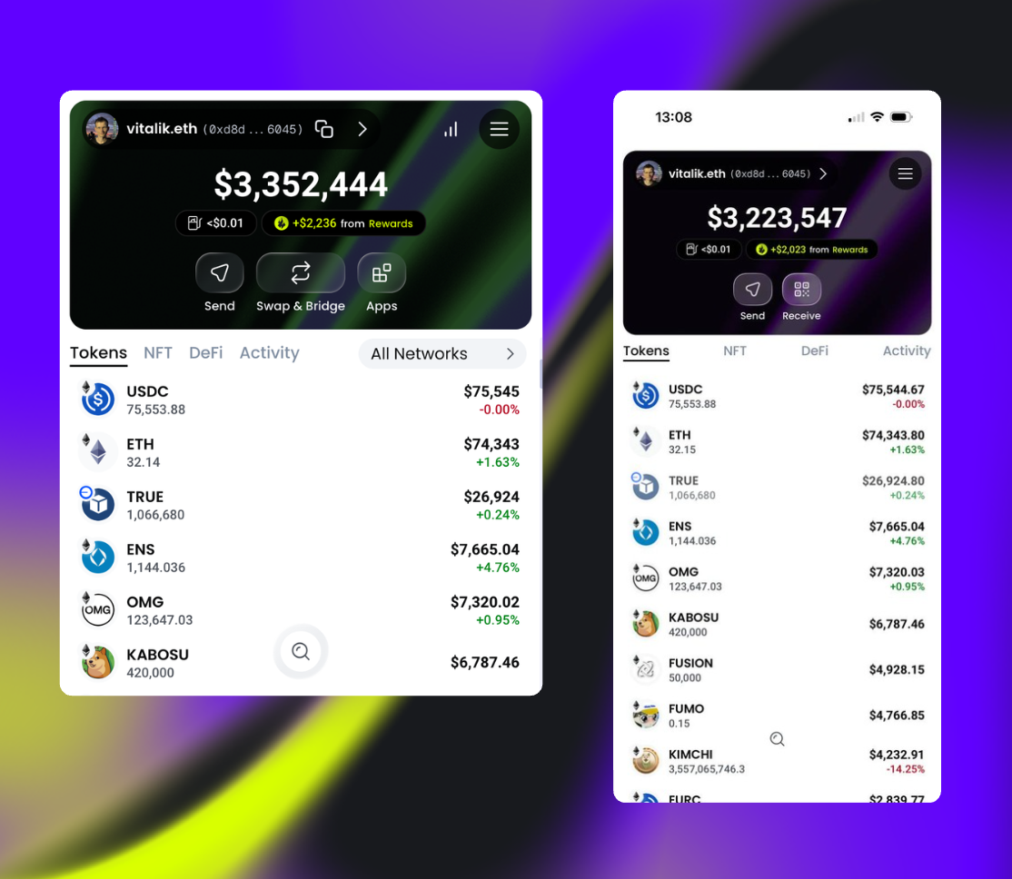
This quickly exposed a problem. The Ambire extension currently has one of the widest windows among browser wallet extensions. Feedback from user interviews confirmed the issue: some testers found the interface overly wide and visually dense. Moving this design to mobile required reconsidering both the layout and the amount of information shown on the dashboard.
Keeping character while improving usability
If you look at the picture above, you’ll notice that Ambire and Rabby are the extensions that stand out from the rest. Ambire differed in several ways:
- The wider window
- Action buttons placed on the right side of the screen
- A three-column token list
- A colorful background header
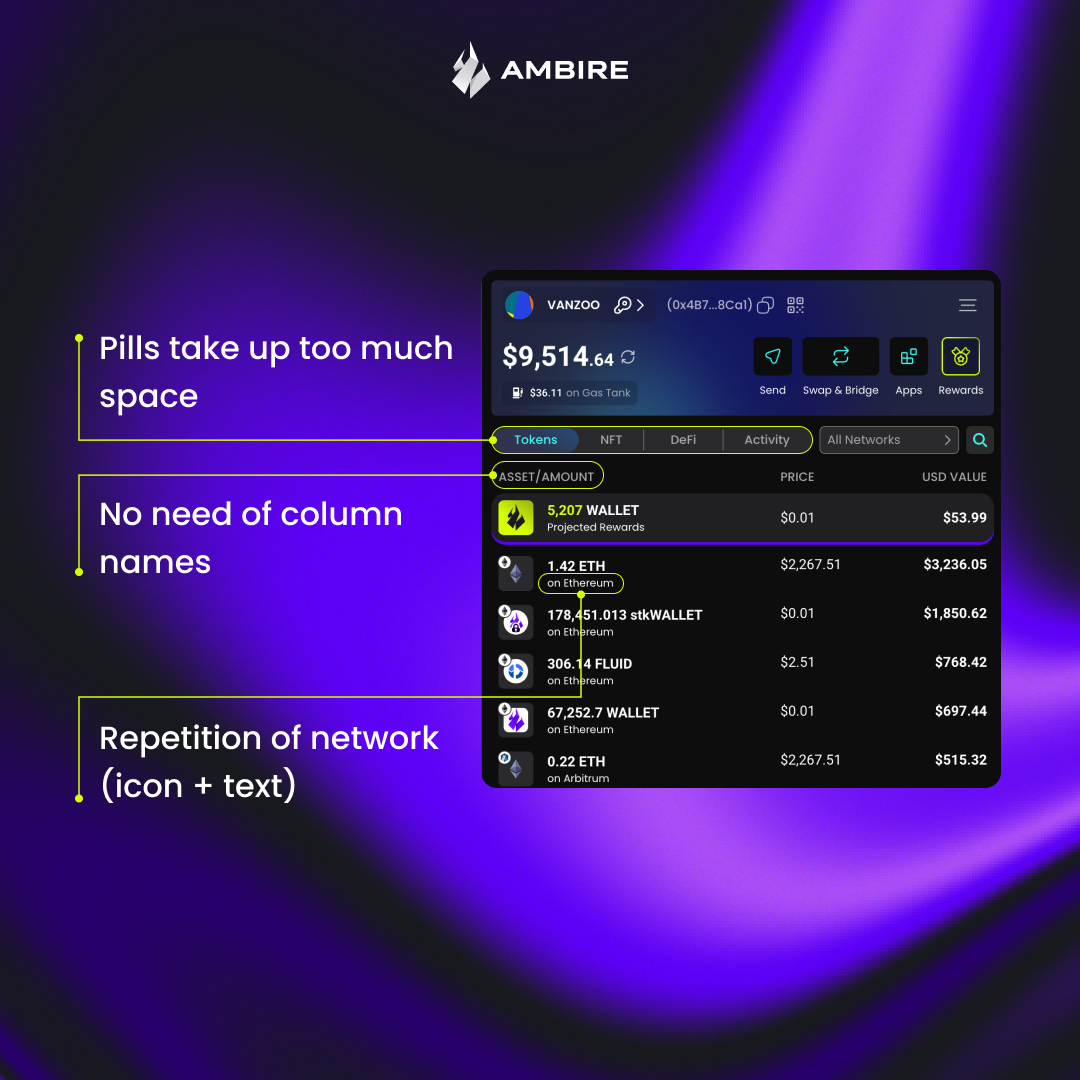
The extension was easy to recognize, but visual distinctiveness should not compromise usability. The three-column token list, for example, displayed less information than competing wallets while occupying more space. Some areas also carried unnecessary elements. Column headers appeared even though the structure of the list was already clear.
Where we aligned with industry patterns
Several parts of the interface did not require experimentation. Established patterns have already solved these problems well. The redesign, therefore, introduces:
- A two-column token list
- Large, centered primary action buttons
- Clear token categories instead of pill-style labels
These changes reduce visual noise and improve readability.
Preserving the Ambire look
Despite these adjustments, the goal was to keep the extension recognizable. With the upcoming mobile app in mind, the interface adopts glass-like elements inspired by Apple’s liquid glass aesthetic.
The Ambire-themed header backgrounds remain in place, giving the wallet a distinctive appearance while the rest of the layout becomes simpler and more structured.
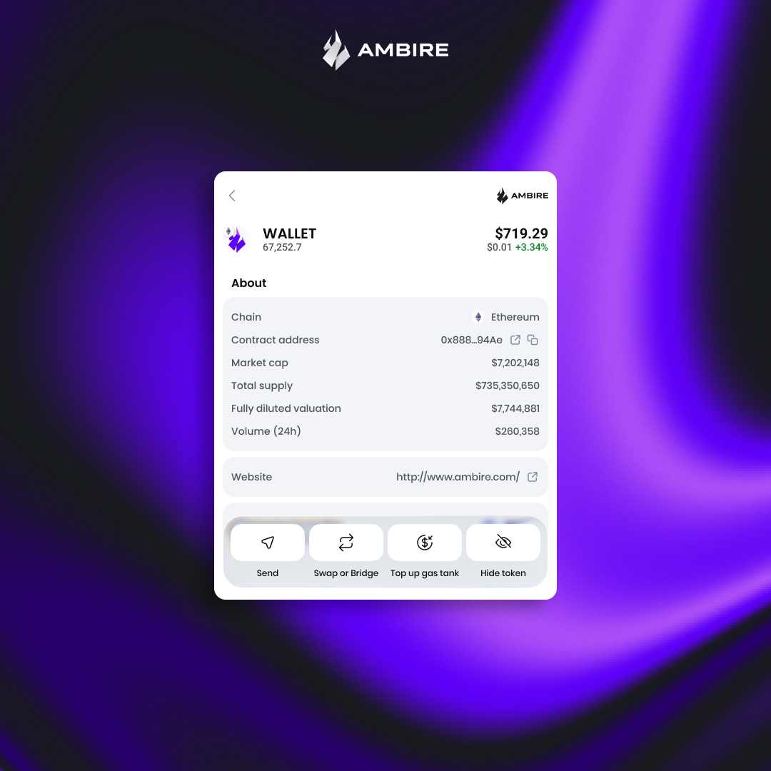
A refreshed token details page
With the new UI, we are also shipping a completely redesigned token details page, which shows all the important information about tokens in your portfolio at hand.
Consistency between devices
Designing the extension with a mobile-first approach also accelerates the mobile app rollout. The long-term plan is for the Ambire mobile app to function as a full companion to the desktop extension, so visual and interaction consistency is essential.
User testing for the mobile app will begin soon, with further refinements based on feedback.
When to expect the new UI
The updated Ambire extension has been submitted for review on the Chrome Web Store*. Once approved, the new interface will roll out automatically to all users. No action is required, and your funds remain safe.
Feedback is welcome. If you have suggestions or ideas for further improvements, let us know in community channels or open a ticket on our Help Center.
*The Ambire extension is available for Firefox as well, but the Firefox release is behind, so if you want to experience the new UI, stick to Ambire for Chrome.
What’s next?
The Ambire mobile app is already being tested by our team, and we hope to let the first beta testers in at EthCC, so come find our booth there and get your hands on the mobile app before anyone else.
Interested in Ambire?
Follow us: Discord | X (Twitter) | Reddit | GitHub | Telegram | Facebook