Ambire Wallet Releases Sleek New Design
Ambire Wallet has rolled out a sleek new design to enhance user experience. The update brings a more intuitive interface for crypto management.

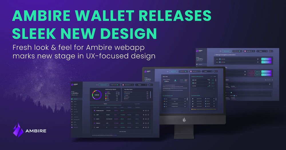
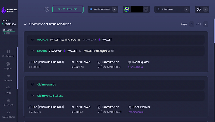
Fresh look & feel for Ambire web app marks new stage in UX-focused design
Exciting news today, Ambire fam 🥳
We just launched our latest UI redesign, and boy, is it pretty 😍 sleek, intuitive and totally 🍬eyecandy 🍬 — check it out and let us know what you think on our Discord.
Meanwhile, let’s see what the fresh interface brings and more importantly… what it anticipates 🫣
Beauty is in the details ✨
how it started how it’s going
— Ambire Wallet (@AmbireWallet) October 8, 2022
brb shipping pic.twitter.com/LdF4q8NVoy
Wondering if we’ve had this in the pipeline for a while🤔? The answer is definitely Yes 😄
We’ve been silently working on improving both UI and UX and soooo excited to finally share with you 🎉 It’s the result of a joint venture between our design team and our… community, of course 👨👩👧👦
The process was actually on-going for a few months now, on 2 levels:
- 🧪Research — we’ve been gathering precious insights and feedback from any interaction possible: direct user input on our social channels, info we collected IRL at events and meet-ups or interviews we conducted with early adopters, power users, crypto influencers and our team; we’re also constantly monitoring analytics on our web app and these give us useful perspectives on user behavior and expectations when using Ambire.
- 🎨Design — we developed design routes, challenged them and reiterated based on internal feedback and the research data we gathered & analyzed; it was hard to stop improving on the design, but when we hit the 👉sweet spot👈, we knew it was time for implementation.
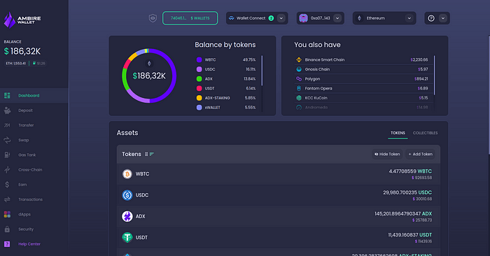
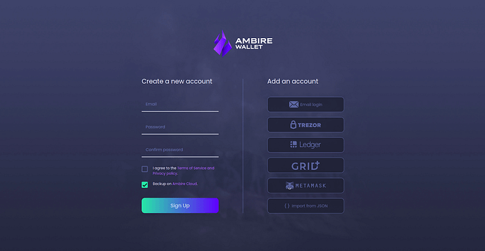
The new design does not bring a radical change at journey level, but rather smoothens and rounds-up the existing one. The color palette has been refined to accommodate a crisp and clear display of information, using more accent colors to represent the diverse portfolios of our users.
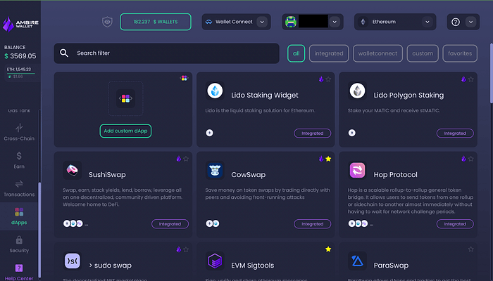
The shapes and elements have also been fine-tuned to deliver a better visual and functional experience, with just a little bit of reorganizing on the dashboard and main pages. This empowers the user with easy overview and control.
The overall goal of our new design is simple: improve crypto UX in general, while offering Ambire users the best interface and experience available on a Web3 wallet 🚀
Redesign launched ☑️ What next?
Ambire Wallet’s new design will be released in stages, and today was the first. We’re still working on some of the pages and modules to make them just right 👌 so we’ll be back with updates as we release ➡️
➡️ Then, the new design will gradually flow to all Ambire Wallet channels and media, aligning the look & feel: from our website to our social platforms, event and partnership branding and of course — the highly anticipated Ambire Wallet mobile app and browser extension 💥
Enjoy the new 🔥Ambire Wallet experience 🔥and feel free to share your thoughts on the fresh design on our socials 👇
Interested in Ambire? Follow us:
Discord | X (Twitter) | Reddit | GitHub | Telegram | Facebook